#Nixplore Yellow
Explore a world of yellow design and inspiration with Nix.

Nixplore Blog: How To Use Yellow in Design
#Nixplore yellow in the Nix Color Column.
It is no surprise that the 2018 ‘Color of the Year’ is vibrant yellow. Yellow is a welcoming color which can bring a radiant feeling. Designing your space with hues of yellow will instantly add a gush of energy to the environment. Producing feelings of strength and stability.
Take a look at these yellow filled designs to enhance your own.
Different hues of yellow often spark different emotions. For instance, using mellow hues in a communal area will bring a sense of relaxation. However, the use of bright hues promotes hunger.


Using accents in your design can be tricky. The general rule to a perfect design is to choose a three-color palette.
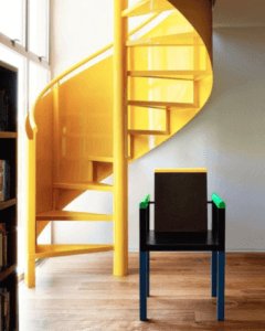
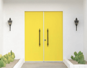
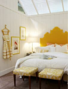
It is important that the dominant color takes up to 60% of the space. While the secondary color takes up 30% of the room. Leaving the remaining 10% as the accent. Yellow is the perfect pop of color to make a design feel fresh and youthful.
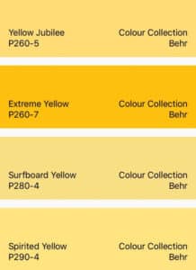
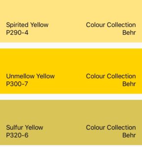
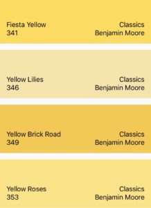
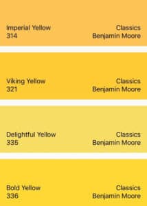
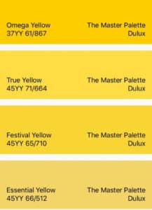
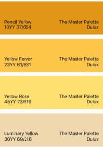
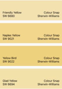
Best of the Brand
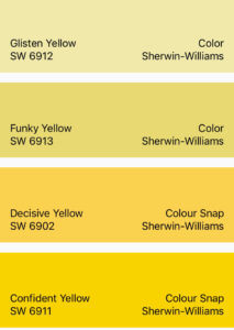
Take a look at some of best hues of yellow from popular paint brands: Behr, Benjamin-Moore, Dulux and Sherwin-Williams. All of these colors can be found in the Nix Paints App library on Apple or Android devices. Make sure you check out our App to #nixplore your favorite paint colors and harmonies.


More to #nixplore
Read on about the history of YELLOW and the origins of yellow pigments. (Click here to read now)
Now share your color themed pictures with us to feature on our future Color Column posts! Tag us on @nixsensor and use #nixplore #nixcolorcolumn on your pictures.
Find us on social media: [wp-svg-icons icon=”facebook-2″ wrap=”h1″] [wp-svg-icons icon=”instagram” wrap=”h1″] [wp-svg-icons icon=”twitter-2″ wrap=”h1″]